| Lesson 3: Upper Air Map |

The figure above is an upper-level isobaric chart, in this cass 300mb for September 20, 2000 at 12oo UTC. Where the isoheights are nearly straight, the wind “flagpoles” point parallel to the lines of equal height. The “flags” on the flagpoles indicate that the strongest winds are observed by the rawinsondes where the isoheights are closest together.
Decoding the Upper Air Data
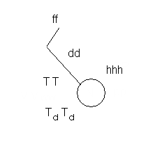
The circle in the station model is centered on the latitude and longitude of the city where the weather balloon was launched. For the upper air maps, temperature is plotted where the number 10 is on a clock (TT) in °C. The dew point temperature (TdTd) is plotted below (at about 8 o'clock) and in the same units as temperature.
The height of the pressure surface of the constant pressure map (hhh) is truncated to keep clutter off the map. You decode those heights as follows:
|
Pressure Level (mb) |
Translation |
Example |
|
850 |
Put a 1 in front |
545 is 1545 |
|
700 |
Put a 3 or 2 in front, whichever brings you closer to 3000 meters |
045 is 3045 AND 968 is 2968 |
|
500 |
Put a zero on the end |
540 is 5400 |
|
300 |
Put a zero on the end |
945 is 9450 |
|
250 and 200 |
For both these, put a 0 on the end, and then the first digit is a 1 or 0, whichever brings you closer to 10,000. |
220 is 12200 |